Wednesday, December 14, 2011

Final Review

1)  Down thurr

2)
1. Rule of thirds-Setting shots up in a way that is pleasing to the eye by using a grid made out of thirds
2. Balancing Elements- Keeping pictures from seeming too heavy on one side
3. Leading Lines- Using lines to move the eye
4. Symmetry and Patterns (repetition)- Keeping a consistent repeating image
5. Viewpoint- Using high-up or low-down angles to make a feel of power or inferiority
6. Background- Keeping a simple background to draw attention to the subject
7. Create depth- Give the picture a more 3-D real life feel
8. Framing- Frame and draw attention to the subject
9. Cropping- Cutting out excess information
10. Mergers and avoiding them- Keeping a little contrast in the subject/background

3)
Aperture- How wide the lens opens up/ how muck light is let in
Shutter Speed- How fast /slow it opens/closes lens
ISO- Light sensitivity

4)  Open up server drives, My Computer>jstudents>photoj>4th>Hauser, John

5) Catchy Headlines, not catchy fonts. Keep it simple, stupid.

6. Removing a few blemishes is cool, but making things that never happened seem like they happened is wrong.

7)
Formal- Very set up, very specific
Environmental- taken  in natural environment, like students in a classroom
Informal- Not as specifically set, but still posed for.
A baby is eaten by a shark. Turned out to just be sidewalk art. 


Jimmy is attacked by bees. He later claimed that it wasn't as painful as expected.

Monday, December 12, 2011


I can't decide between the two

Also, all of my photos for the mural are gone for some reason, but I really liked how the Pantera one came out.

Best Covers

#2 informal, #3 informal , #10 formal, #19 formal, #26 informal, #31 informal, #36 formal, #37 environmental


This magazine cover story by legendary writer John Sack helped change public perception of the Vietnam War and was a landmark in the history of New Journalism. Early in 1966, when America had little more than 100,000 troops in Vietnam, Sacks became Esquire's war correspondent in Vietnam. At 33,000 words, the resulting article was and still is the longest ever published in Esquire. The all-black cover with the white inscription, "Oh My God We hit a little girl," became the cover to reflect the story.           
The simplicity of this cover is what makes it what it is. It's straight to the point, and that's really all it needs to be. The off-white over the black background  gives it a dark feel, a gritty feel. The subject matter it's self is also really powerful, the Vietnam War was a devastating disaster, that decimated our youth. It killed thousands and left many others with severe mental trauma.

Thursday, December 8, 2011

Lytro

1. What did you see happen when you clicked on the photo?
It refocused
2. How does this new camera work?
I guess it takes a picture of everything in high def, then focuses it later
3. What do you think a photographer would have to know about to take this kind of photo
How  it works, and how it's gonna look with different focus points
4. Is it worth the money?
Naw

Friday, December 2, 2011

Rules of Photography 2

Lines
Cropping

Pattern

Veiw

Balance

Rule of Thirds

Background

Depth

Framing


Mergers
(My theme was bands)

Self Portraits 2

Don’t be afraid to do a bit of photoshop jiggery pokery – you can do a lot of cool stuff by ensuring you’re in the photo multiple times, for example

 A mirror or some other reflective surface offers an even easier way to take a self-portrait. In most cases, the camera will be included in the scene

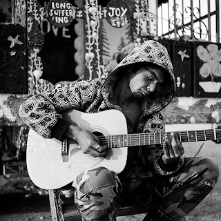
I liked this one because he's got that face of concentration going on. I've totally been there before, simply entranced by what you're playing.

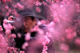
I thought this was cool because of the flowers in the front, it throws an overall scheme to it.

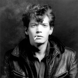
This one's cool 'cause it's like a softer, more reflective side of Mr.Tough Guy
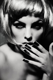
I like this one because her nail polish is so smeared. It's gives her this chaotic feel

This was cool cause it's all serious and stuff.
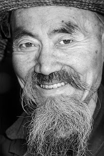
I like this one for his beard.


    For my portrait assignment, I have no idea who I'm gonna shoot, if it's still rainy and whatnot, I'll probably shoot someone in the courtyard. To make it successful, I'm gonna have them causing a human eclipse on the sun.

Wednesday, November 30, 2011

Portrait

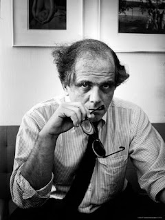
I really liked this one. The lighting was reminded me of a Sunday morning. His expression was priceless. And his hair was messed up, it looked as if someone took this right as he woke up.

Her face is awesome. I's just like, I'm old, but I still have fun and laugh. The bookshelves were a good background choice for this one.


I'd definitely want to do a casual shot, they're cool.

Shortlist Warm up

Wildlife: I like this one because Giraffes rule.

Creative License: I liked this one because it was not only a cool photo, but it was also self shot.

Documentary: I thought the hand looked cool in this one

Fashion: I thought this was cool because of that shadow

Landscape: I liked the colors and vibrancy

Gardens and Plants: I liked the abstractness of this shot


Family: I thought it was funny to see his draws.

Portrait: Basset Hounds are my favorite dog

Travel: I liked the water

I liked this because homeboy didn't care
   

Monday, November 21, 2011

Ethics in Fashion

1.-Elongated neck
-Bigger eyes
-Brighter eyes
-Fuller lips
-Blemish Removal
2. No. It's totally wrong, it gives this glamorized, fake perception of the product, and it's a huge influence on the societal view of beauty. It makes girls strive to achieve an impossible look, and leads to psychological problems.

3. I guess, like completely faking events and whatnot.

4. A little color enhancement and blemish fixes here and there are cool, but that's it.

5. Fashion photography is just a bunch of fake bull to make you want to buy something, and photojournalism is to tell stories through artistic photography.

6. Fashion photography shapes reality and Photojournalism captures it.

Thursday, November 17, 2011

Worst/Best Alterations

This was the most unethical photo because this was never actually photograpghed
All the did was move the Pyramids closer together. It's not a big deal, just a magazine cover.

Ethical Altering

A. Long story short, people messed with pictures, and lost their jobs.
B. Messing with pictures is wrong because it takes the viability out of the picture.

National Geographic Warm Up

I really liked this photo. The way he's kind of looking over at the audience and clenching his mouth makes it seem like he's a little irritated, like he was in deep thought before you interrupted him. He has a great sense of wisdom with age to him.

A picture of somebody in a room, by a window

Tuesday, November 15, 2011

Abandoned Theme Parks

1. Out of all of these theme parks, Takakanonuma Greenland, Hobara, Japan, looks like the one I'd want to visit most. I like the way that everything is all rusty and deteriorating. It gives it the creepy feel that none of the other parks seem to do as well. It looks like somewhere where I would want to film a video or movie. 


2.


3.  
-Drainage Ditches
-Water Processing Plants
-Inside Airplanes (like, not the sky and stuff, the people in the plane)
-Movie Theaters
-Gas Stations

4.

5. I think it'd be pretty cool to take photos of drainage ditches. As a kid there were, and still are, a lot of drainage ditches by my house. My friends and I used to go play in them all day. I'd probably take some retrospective photos, with like, me and my friends playing in them as teenagers now. 

6. I pretty much just need a camera, and my friends. Maybe a little food money. And that's it.

Wednesday, October 19, 2011

B&W Photographers 3

1. I really like Harry Callahan's style when I first saw his stuff. It was when I saw the baby Photo that I really knew that he was unique and cool and stuff.
 a) The Chairs
I see chairs everywhere
I smell the sweet, tender scent of dead leaves
I hear children asking their mothers why those strange men had all of those chairs
I taste Autumn air
I feel lost and uneasy
b) The Baby
I see a small child on a black fabric
I smell workshop scents and babys
I hear a crying baby
I taste sawdust
I feel kinda depressed

3. This

I'm so Funny

Jerry decides that hats are too mainstream for him.
Jerry learned his lesson about making bets with an acupuncturist.
George discovers that noses CAN be like Capri Sun packets.
After 2 long months, George, the acupuncturist, won that bet against his buddy, Jerry that he could actually could put his finger through his nose.
Billy pisses his pants after seeing his dad's friend, George stick his finger through his nose
Billy just couldn't hold it anymore, dad's steps were worse than driving over speed bumps.
.

Monday, October 17, 2011

Frog in the Rain HDR

I chose this photo because i really liked the way the light looked against the water.In this picture, the photographer used Lines, Balance, and Simplicity.

HDR Photography

1. What do you have to do on the camera to make this type of photo?
Auto Exposure Bracketing
2. Look up a Canon T3 on google and tell me if it has the ability to shoot bracketed photos?
Yes
3. Is there a place on campus we could take a series of photos like this?
In the hall, in the courtyard
4. Do a google image search for HDR photos and find your favorite, post it on your blog, tell me why you picked that photo and then tell me what techniques (rules of photography) the photographer used.

Instagram Story

1. What theme that we could take here at school could we do a series of these panels to place around the school?
Thought
2. Should we use phones only, or should we open it up to our regular cameras for those people that don't have camera phones?
Phones, cameras, drawings, any medium of expression
3. Where would you want to put the mural on campus?
Anywhere it'll fit.

Best Photo

ISO: 6400
Shutter Speed: 1/500 F-stop: 5.6 Distance: 7ft Focal Length: 37.0mm Lighting: Indoors


Fixed Photo Shoot Post shoot reflection


1. What did you learn about the camera when you took these photos?
It's difficult to get the settings just right

Look at the photos you took, they are located here:
Jstudents > (your period) > TRIAL PRACTICE SHOOT > (folder with your name on it). 
Make sure you view the photos as Extra Large Icons to see them fully.


2. What do you notice about all the photos and the way they look?
They all look like paint samplers

3. Can you tell the difference between each ISO? Explain how.
We all shot with the same ISO... I guess we weren't supposed to do that

4. What does this tell you about ISOs and what it does when you change it when you take pictures.
Nothing, we did it wrong

5. What about focus? Can you see a difference in the photos? Tell me what differences and similarities you see.
Focus was fine,it was generally the same throughout.

6. Post the best photo you took on your blog. Make sure to label the following things: ISO, Shutter Speed, F-stop, Distance, Focal Length, Lighting.
Okay.

7. What do you need to concentrate on when you go out to shoot next time when you have to shoot in Manual setting?
The shutter speeds

Wednesday, September 28, 2011

Shutter Speed

Fast

S L O W

At the beginning while the sun is still partially up and the courtyard has reasonable light
a.) the dunking booth-Fast
b.) the food eating contest-Medium
c.) the rock climbing wall-Slow
d.) someone working at a booth-Slow
e.) the DJ/MC working at the middle of the circle-Medium
f.) the Diamonds performance-Really fast

Towards the end when there is no sun and has gotten dark enough that you can't see from one end of the courtyard to the other.
a.) the dunking booth-Medium
b.) the food eating contest-Medium/slow
c.) the rock climbing wall-Slow
d.) someone working at a booth-Slow
e.) the DJ/MC working at the middle of the circle-Medium/slow
f.) the Diamonds performance-Fast
  1.  Aperture Priority- Shutter speed already covered, just set the aperture
  2. Shutter Priority- Aperture's covered, just set the shutter speed
  3. Manual- Set the shutter speed and the aperture

Aperture

f 2.8

   
f 16
1. The pupil
2. The smaller the Aperture number, the higher the Aperture size.
3. Aperture brings the point of focus into the clear and blurs the background
4. 3.5-5.6?

Monday, September 26, 2011

Nick Brandt

This was my favorite because it's just kinda funny. 

a. Nikon
b. He took these photo's to capture the beauty of the endangered African wildlife
c. To help save them from endangerment
d. I can't find any...

Academic Shoot Reflection

1. What challenges did you encounter while trying to get the photos following the rules I set out for you?
 
I was mostly having trouble remembering all of them.

2. What technical aspects of photography or the assignment in general (focus, framing, holding the camera, etc.) did you find yourself thinking about the most? Provide a specific example of what you did to do this correctly.
 
Focusing was my big thing, and I was trying really hard to get things focused the way I wanted, but autofocus is lame.

3. If you could do the assignment again, what would you do differently now that you know some basic rules of photography?


I would move around less while I was shooting, and try to memorize all the rules better
4. What things would you do the same?


I'd go to the same classrooms.
5. When you go out with your next set of prompts, which rule do you think will be the easiest to achieve?


Rule of Thirds
6. Which rule do you think will be the hardest to capture?

 
Balance
7. What rule are you still not totally clear on and what can you do to figure out what that rule is?


I don't know much about balance, but I'll look it up later
 

Thursday, September 22, 2011

Acedemics Shoot

Lines.I followed the rule alright in this picture. I was trying to get the hand for my subject, but that didn't really work to well. I should have shot it from a better angle, and while he was still writing.

Avoiding Mergers
I obviously didn't follow this rule, because I was told not to, but Mr. Izor totally merges with the wall because of the low-lighting.

Simplicity
I followed the rule pretty good here, mostly basic shapes and solid colors for the background, a simple subject, and not to much action going on here ether. The subject was the 2 guys sitting in class, i felt that was pretty obvious.

Rule of Thirds
 I used the rule when setting up this shot to frame my subjects in the corner for a more generally eye-pleasing picture. My subject were the 2 students in the corner paying attention to their lesson. I think I did a pretty good job of making that clear.

Balance
I kept this balanced by keeping Mrs. Delmore not too much to the side, but also not perfectly centered. It's pretty clear that she's the subject here.

Framing
All the lines in this picture frame Kyria's face. She's the subject, and I made that pretty easy to recognize in this one. Also, I like the way the attendance thing is right there in the corner.